Executive KPI Dashboard
One attainment column that scores revenue and costs correctly, without you inverting anything by hand.
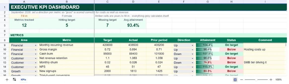
About the executive kpi dashboard
Most KPI spreadsheets quietly get costs wrong. If a metric is scored as actual divided by target, then a cash burn target of $95,000 with actual spend of $88,400 reports 93% attainment, as though coming in under budget were a failure. This template asks for a direction per metric and inverts the ratio when lower is better, so under-spending scores above 100% and over-spending scores below it.
Twelve metrics ship pre-built across four areas: financial, customer, growth and operations. Each carries a target, an actual, a prior-period figure for context, a direction, and a free-text comment. Attainment and a plain-English status are derived from those.
The area roll-up at the bottom counts metrics per area and how many are hitting target, and averages attainment within each. That's usually the view an executive summary needs, not twelve numbers, but four, with the detail underneath for anyone who asks.
What’s in the template
Everything below is already built into the file. Open it and it’s there.
Summary strip
Metrics tracked, how many are hitting target, how many are missing, and average attainment across all of them.
Twelve pre-built metrics
MRR, gross margin, cash burn, net revenue retention, churn, NPS, signups, trial conversion, CAC payback, page load, ticket resolution and uptime.
Direction column
Up or Down per metric, which is what lets a single attainment formula serve both revenue and cost targets.
Prior-period column
Context alongside the target. A metric below target but well up on last period is a different conversation from one that's flat.
Automatic status
On target or Below, derived from attainment, and counted by the summary strip and the area roll-up.
Area roll-up
Metric count, on-target count and average attainment for each of the four areas.
Who it’s for
Founders reporting to a board
The four-area roll-up is close to the shape most board packs want, and the metric table underneath answers the follow-up questions.
Operations leads running a scorecard
Direction-aware scoring means cost, latency and churn metrics sit in the same table as revenue without special handling.
Department heads with mixed metrics
One table serves percentages, currency, counts and durations, since attainment is a ratio and doesn't care about units.
Anyone tired of rebuilding the same slide
Update twelve actuals monthly and the whole summary regenerates rather than being retyped.
How to use the executive kpi dashboard
- 1
Replace the metrics with your own
Keep the four area names or rename them; the roll-up matches on whatever text is in the area column, so update both places together.
- 2
Set the direction on every row
Up for metrics you want to grow, Down for costs, durations and churn. A blank direction is treated as Up, which will misreport any cost metric.
- 3
Enter target and actual in the same units
The column mixes currency, ratios and counts deliberately. Attainment is a ratio, so it only matters that a row is internally consistent.
- 4
Update monthly and move the prior period
Copy last month's actual into the prior-period column before overwriting the actual, and the trend column keeps its meaning.
The formulas that ship with it
Every one of these is already in the file. They’re listed so you can see how it works, and change it if you want to.
Attainment (column G)
=IF(OR(B9="",C9=0,D9=0),"",IF(F9="Down",C9/D9,D9/C9))Actual over target normally; target over actual when the direction is Down. That inversion is the whole point of the direction column.
Status (column H)
=IF(G9="","",IF(G9>=1,"On target","Below"))Anything at or above 100% attainment is on target. The counts in the summary and roll-up both match this text literally.
Average attainment by area
=IF(COUNTIF($A$9:$A$38,A41)=0,"",AVERAGEIF($A$9:$A$38,A41,$G$9:$G$38))Averages attainment within one area, guarded so an area with no metrics shows blank instead of an error.
Tips for getting more out of it
- Twelve metrics is already a lot. If everything is a KPI then nothing is, and the average-attainment figure becomes noise.
- The prior-period column is what stops a red dashboard from being demoralising. A metric at 78% of target that was at 66% last month is progress.
- Leave the target and actual columns unformatted, as they ship. One format can't serve $420,000, 0.72 and 45 in the same column.
- Ask the assistant which metrics moved most against prior period. It's a faster read than scanning twelve rows.
Ask questions about your data, generate formulas in plain English, and create charts instantly, all on top of the Executive KPI Dashboard.
Questions about this template
More business templates
Project Task Tracker
Owners, due dates and progress per task, plus a live count of what's overdue.
Use thisProfessional Invoice
Fifteen line items with per-line discounts. Subtotal, tax and balance due calculate themselves.
Use thisEmployee Directory & Org Chart
Contact details and reporting lines, with tenure and department headcount derived automatically.
Use thisSave hours
Skip the setup. Start from a ready-made structure.
Error-free
Pre-tested formulas that just work.
Professional
Designed for real-world use, ready to share.
Consistent
Maintain standards across every document.
Ready to use the Executive KPI Dashboard?
No setup, no learning curve, just results. Start free in seconds.
Pay as you go, no subscription required