Making a chart in a spreadsheet isn't hard. Making the data chartable is. Most exports, whether from Google Analytics, an ad platform, a CRM or a payment system, come out in a shape no chart can use, and the fix is a pivot table, a few SUMIFS, or ten minutes of copying cells around.
So we tested the whole job, not just the drawing part. We took nine months of website traffic, exported the way these tools usually export it (one row per month per channel, with sessions, signups and spend), opened it in SheetAI, and asked for charts. Everything below is from that session.
The data, and the reshaping nobody wants to do
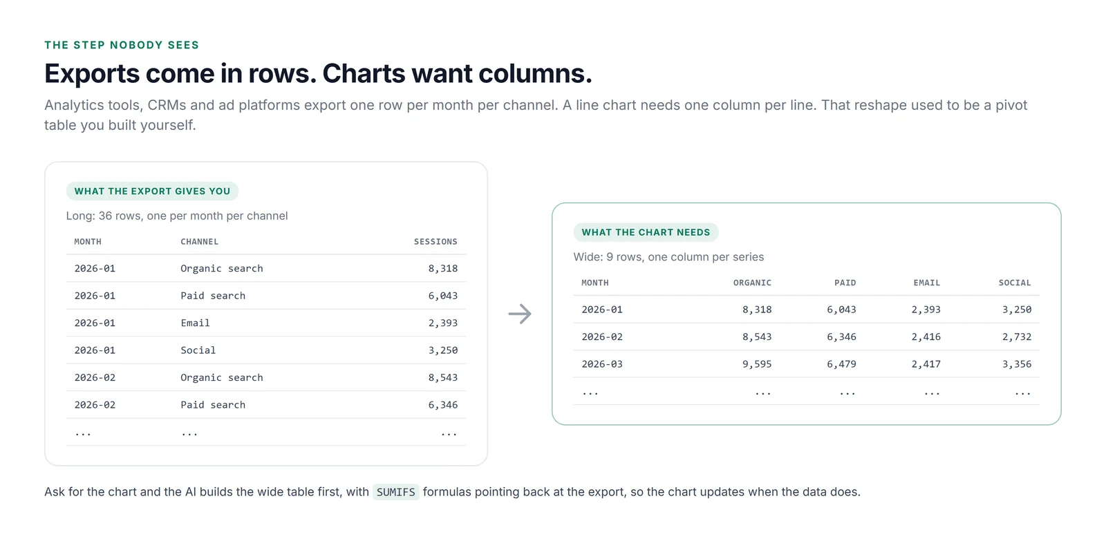
Here's the problem in one picture. A line chart wants one column per line. The export has one row per month per channel: 36 rows, with the channel name repeated down column B. You can't select a range and press Insert Chart. There's nothing sensible to select.
Step 1: Ask for the chart in plain English
We started with the simplest prompt we could think of, the one most people actually type:
Make a chart of sessions by channel over time.
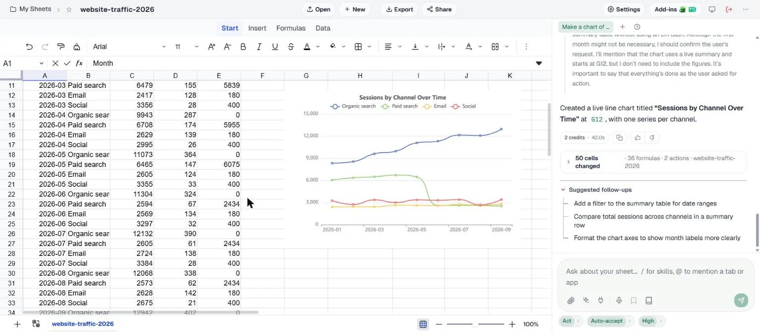
It did the boring part properly. The summary table is 36 SUMIFS formulas pointing back at the export, not pasted numbers, so if a figure in the export changes, the chart changes with it. And the chart tells a story immediately: organic search climbing all year, and paid search falling sharply in June, from 6,465 sessions in May to 2,594.
Step 2: Ask the question, not for the chart
"Sessions by channel" is a description, not a question. What you actually want to know when paid search drops by 60% is whether it mattered. So the second prompt asked that:
Paid search was cut back in June. Did total signups drop with it, or did other channels make up the difference? Answer with a chart I could paste into a monthly report, plus two sentences.
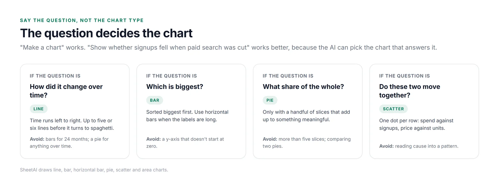
It came back with a second line chart, "Monthly Signups by Channel", that included something we hadn't asked for but needed: a Total signups line across the top. That's the line that answers the question.
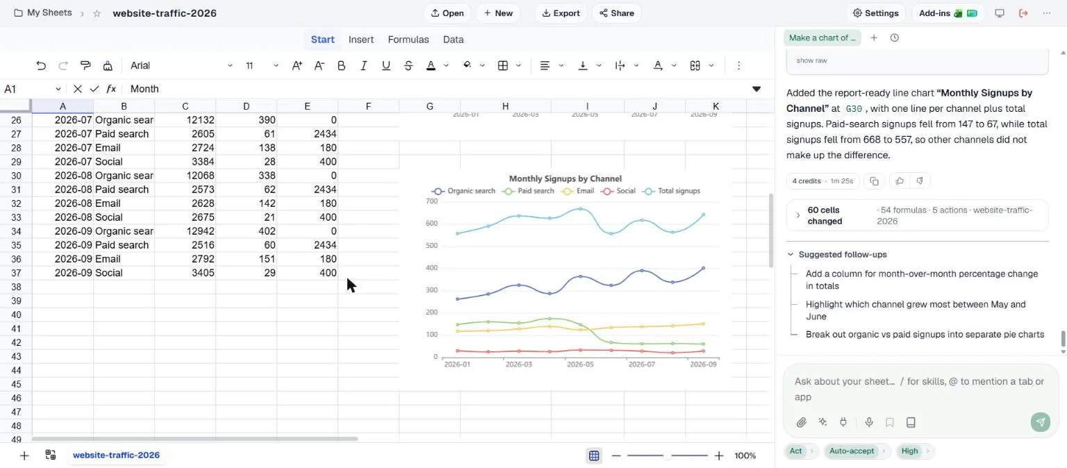
The written answer was precise: paid search signups fell from 147 to 67 and total signups from 668 to 557 between May and June. Every number matched the export. But look at the total line after June. It climbs back. That's worth a follow-up question.
Step 3: Follow up, and tidy the layout
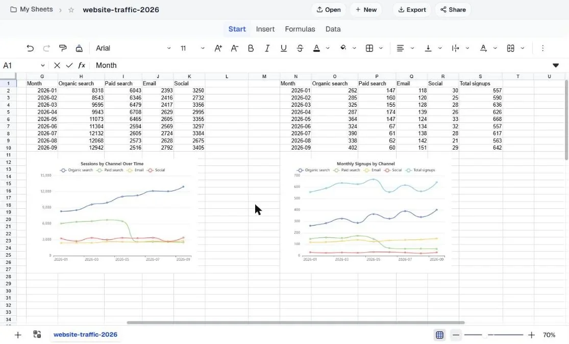
Two short follow-ups turned this into something you could send. The first asked what happened to total signups from July to September. The second asked for a report layout: the raw data left alone in columns A to E, and both summary tables and charts side by side to the right, with no chart covering any data.
The answer: 617 signups in July, 563 in August and 642 in September, back within 4% of May. That changes the story completely. And the layout came back the way a report needs it, with two summary tables, two charts beneath them, and the raw data untouched.
What the data actually said
Since the point of a chart is the conclusion: cutting paid search in June cost about 80 paid signups a month. Total signups dropped 17% in June, then recovered to 642 by September as organic search kept growing, roughly 4% below May. Paid search spend fell from around 6,000 a month to 2,434. Whether trading 4% of signups for 60% of the paid budget is a good deal is a business decision, but the chart makes it an easy one to have.
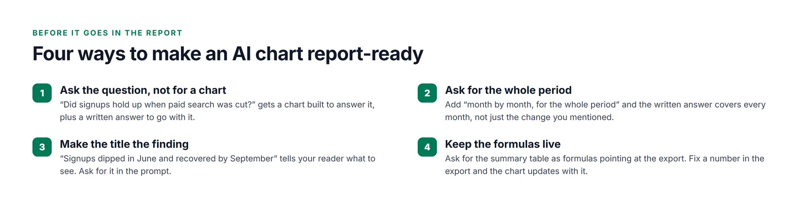
Four ways to make an AI chart report-ready
Prompts you can paste
| When | Prompt |
|---|---|
| First look | Make a line chart of [metric] by [category] over time. Build the summary table with formulas so it updates. |
| For a report | [Your question]? Answer with a chart I could paste into a monthly report, plus two sentences. |
| Whole period | Describe the whole period month by month, in one sentence each. |
| Comparison | Bar chart of [metric] by [category] for [period], sorted biggest first. |
| Title | Retitle the chart so it states the finding, not the data. |
| Layout | Put the summary tables and charts side by side to the right of the data, with no chart covering any cells. |
Would we do it this way again?
Yes. The reshaping and the first chart took forty seconds, something that used to mean building a pivot table, and with live formulas, which a pasted pivot doesn't give you. Asking a real question got us a better chart than we'd have made ourselves: we wouldn't have thought to add the total line. And a one-line follow-up turned a June comparison into the whole summer's story.